
My Fitness Pal
App Redesign
Introduction
MyFitnessPal is a leading calorie tracking app that helps users achieve their fitness goals. The app offers a comprehensive database of foods and drinks, as well as a variety of features to help users stay motivated and on track.
Scope & constraints
- Scope: Redesign focused on the core daily experience—Home/Dashboard, logging entry points, progress overview, and a few supporting screens needed to complete these tasks.
- Out of scope: Onboarding, subscription/paywall, community/social features, and backend logic (nutrition database accuracy, recommendations algorithm) were intentionally not redesigned.
- Constraints: UI/UX improvements assumed no backend changes; the goal was to improve clarity, navigation, and speed-to-action using layout, hierarchy, and interaction changes.
- Platform: Designed for a single platform (iOS/Android) to keep patterns consistent and reduce complexity.
Evidence
- App store review themes (directional): Reviews repeatedly mention friction in logging, screens feeling busy, and difficulty finding key daily numbers quickly (e.g., remaining calories/macros).
- Competitive scan (directional): Many fitness trackers prioritize a single primary action (Log/Track) and keep the dashboard focused on today’s status rather than showing too many secondary features upfront.
- Heuristic review (Nielsen-style checks): Several screens showed high cognitive load (too many competing elements), inconsistent hierarchy, and unclear action priority, which can slow down routine tasks like daily tracking.
- Design implication: The redesign prioritizes a “today-first” dashboard, clearer primary CTA for logging, and simplified navigation to reduce scanning and decision effort.
Desk Research
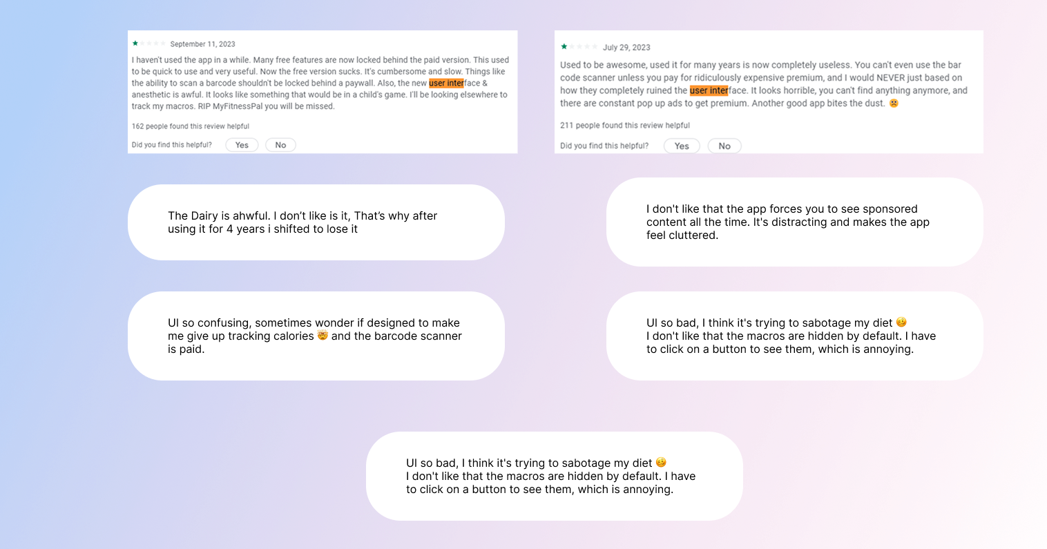
Due to the short timeframe of the project, I was unable to conduct user interviews in person. Instead, I gathered feedback from MyFitnessPal users in two ways.
I analyzed the user feedback section of the MyFitnessPal app and noted the negative feedbacks related to UI with the highest number of reacts.
I also joined several MyFitnessPal Facebook groups and asked users to share their feedback on the app's UI. This gave me a more in-depth understanding of users' specific concerns and suggestions.
Key Insights
After carefully reviewing user feedback and observing app layout. I have identified several key insights. Mentioned in the list below.
- Due to poor navigation bar, its hard for new user to figured out how to add food.
- Users are unhappy that the barcode scanner is a paid feature. They believe that it is a basic feature that should be included in the free version of the app.
- Not any way to see the image of food, while many foods have same or different names.
- Users find the UI to be outdated and boring. They would like to see a more modern and stylish design.
- UI is too cluttered and confusing. They would like to see a more streamlined and efficient interface.
Problem Statement
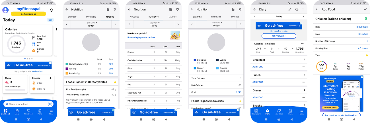
MyFitnessPal's current user interface (UI) is difficult to navigate, has too many ads, feels outdated, and users dislike the paid barcode feature. These factors are frustrating users and impacting their ability to achieve their fitness goals.
Evidence
- User research has shown that many users find the MyFitnessPal UI to be cluttered, confusing, and difficult to use.
- Users have complained that it is difficult to find the information they need quickly and easily.
- Users have also expressed dissatisfaction with the overall look and feel of the UI, which they find to be outdated and unprofessional.
- Finally, many users have expressed disapproval of the paid barcode feature, which they feel is unnecessary and overpriced.
Solution
To redesign the MyFitnessPal UI to be more intuitive, streamlined, and modern. This would be achieved by:
- Using a clear and consistent design language
- Making the app easy to navigate
- Organizing the app in a logical way
- Using white space to make the app more visually appealing and easier to read
Screens selected for redesign
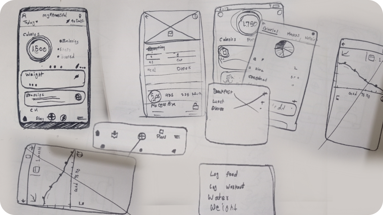
Sketching
Before diving into the actual design process, I created some rough sketches. These sketches were essential for exploring different ideas and quickly refining my designs.
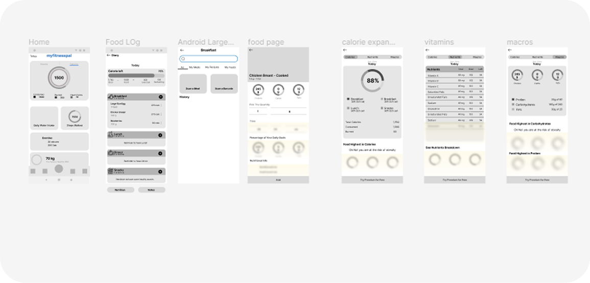
Wireframing
After creating some rough sketches, I created low-fidelity wireframes to get a sense of how the design would look and feel.
Wireframes were essential for testing different layout and navigation options, identifying potential usability problems, and communicating my ideas to others.
User Testing
After completing the design and prototype, I returned to the Facebook groups to ask users for their feedback. I shared my prototype with them and conducted usability testing with five users to evaluate the usability of the new design.
I asked each user to review and experience the new design prototype. While they were unable to use the app in the same way as the original, they were able to get a sense of the user experience.

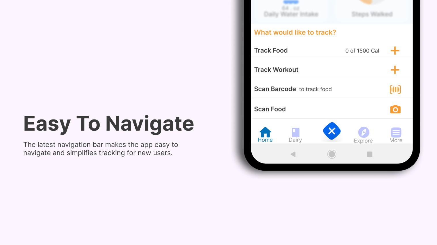
One of the key findings from my usability testing was that users found the food logging feature to be much easier to use than the previous design. They appreciated being able to see the picture of foods while logging, and the bottom navigation bar was a particularly popular feature.
Another key finding was that users can now use the barcode scanner to add food for free by watching an ad. This makes the premium feature more accessible to users, which could lead to increased adoption and engagement.
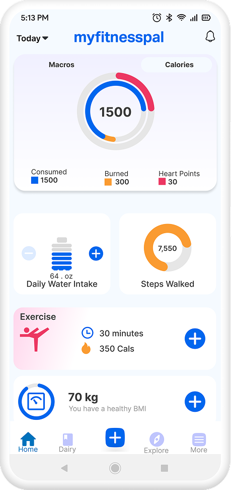
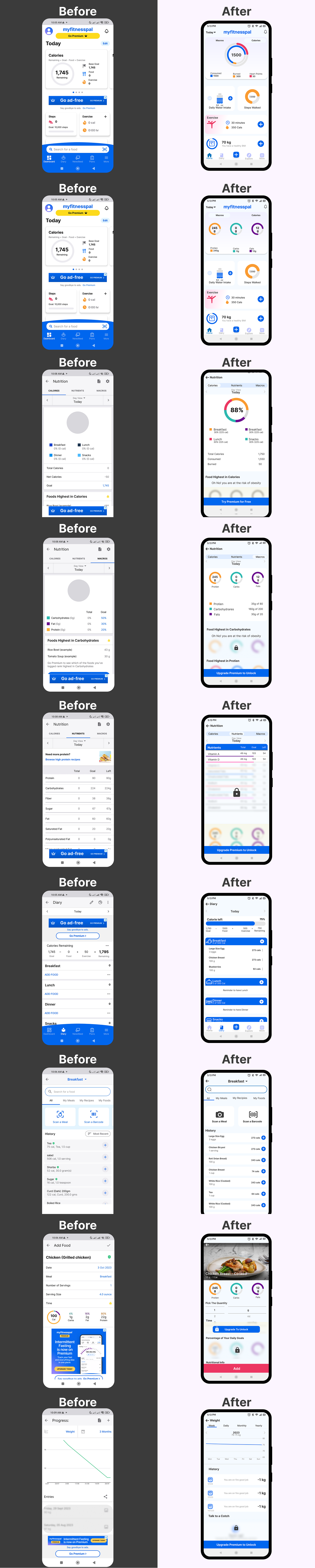
Before & After
Results
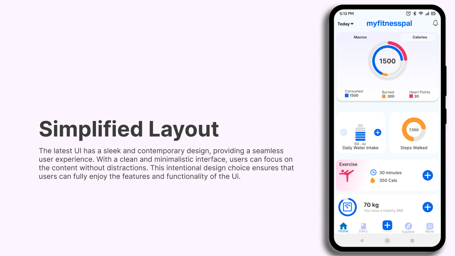
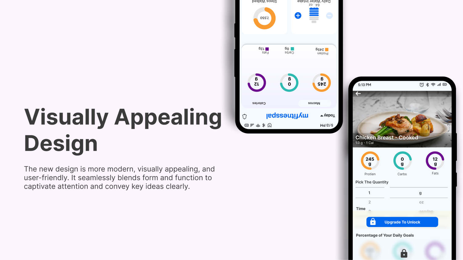
This concept redesign improves the daily tracking experience by clarifying hierarchy on the Home screen, reducing visual noise, and making logging the most obvious next action. The expected outcome is faster logging and easier scanning of key metrics like calories/macros.
Success criteria (to validate)
- 20–30% faster time to log a meal.
- 90%+ task success for "find remaining calories/macros."
- +10% increase in daily logging completion.