WordPress
Sidebar Redesign
For Plugin-Heavy Sites
Introduction
WordPress is the world's most widely used content management system, powering millions of websites across blogs, businesses, and large-scale platforms. Its flexible plugin ecosystem allows users to extend functionality easily, but this flexibility can also introduce usability challenges within the admin experience— especially for sites that rely on many plugins.
At A Glance
The Problem
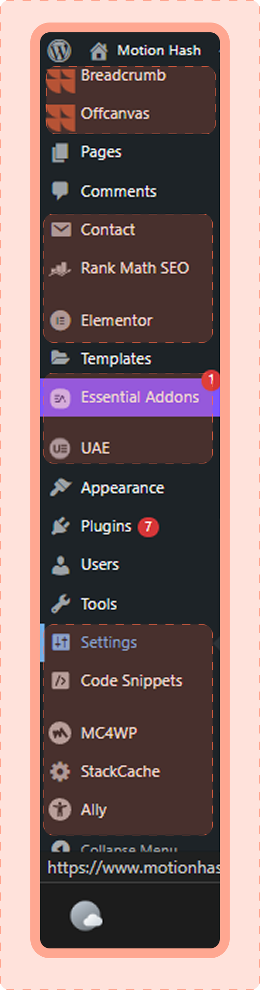
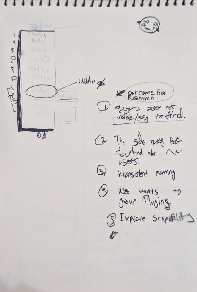
Plugin-heavy WordPress sites suffer from a cluttered wp-admin sidebar where plugins add inconsistent top-level menu items, making navigation hard to scan and time-consuming.
Goal
Improve navigation clarity and speed by reducing sidebar clutter while keeping the familiar WordPress admin experience intact.
Solution
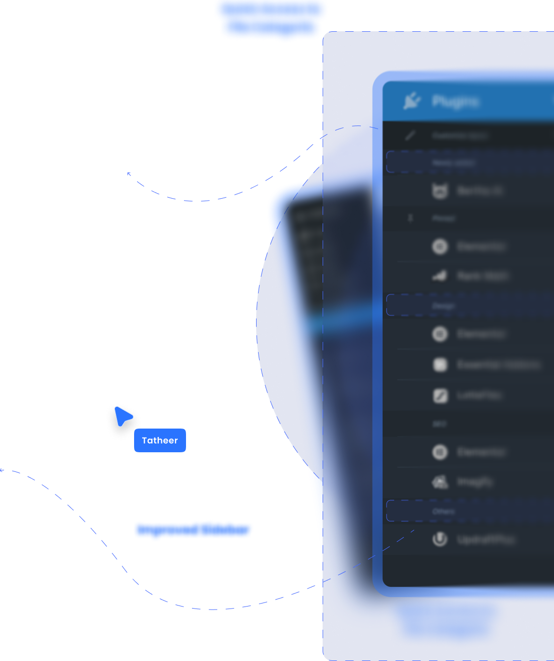
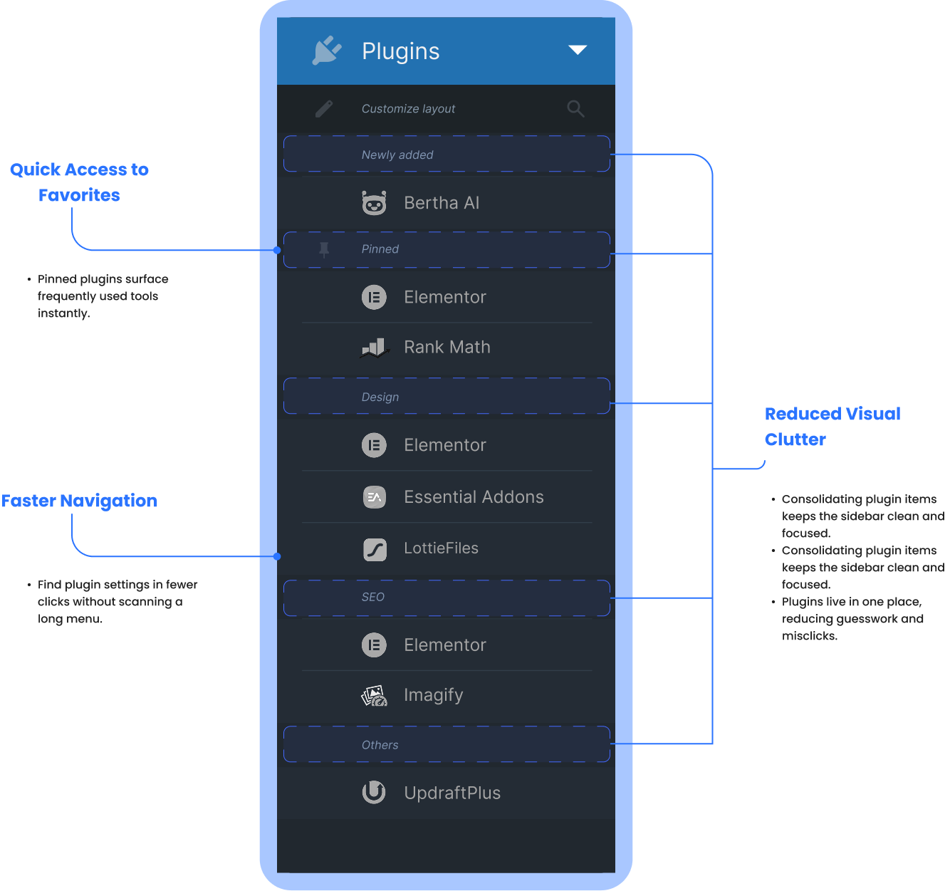
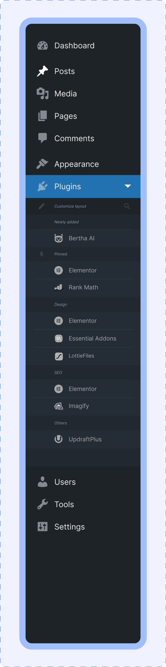
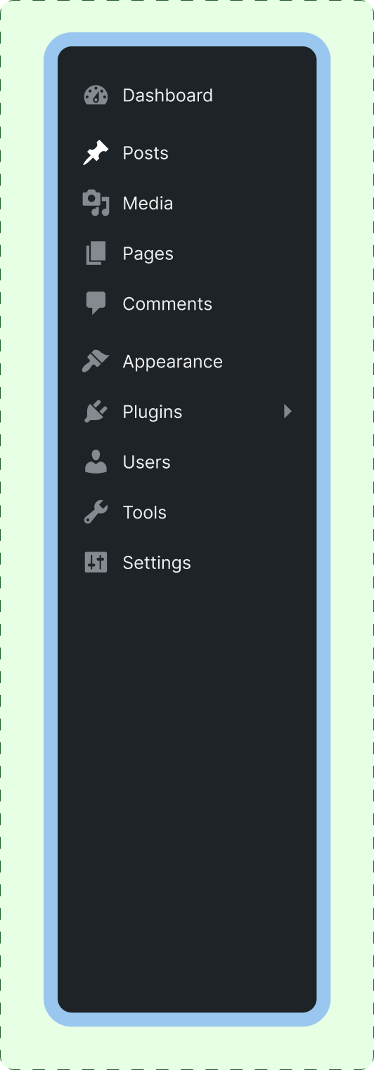
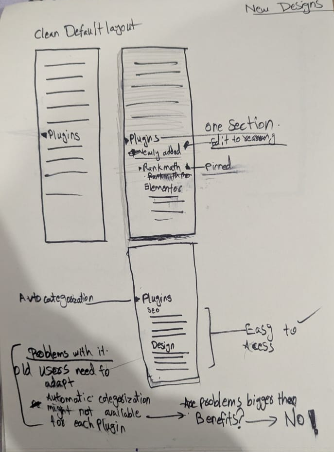
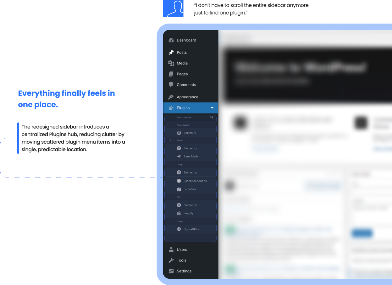
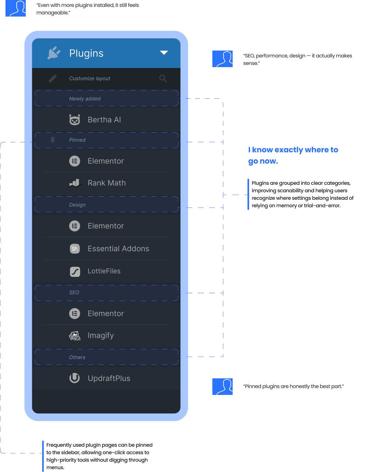
Introduce a single Plugins hub with categorized plugin settings and a Pinned section for frequently used tools, without changing WordPress's visual style.
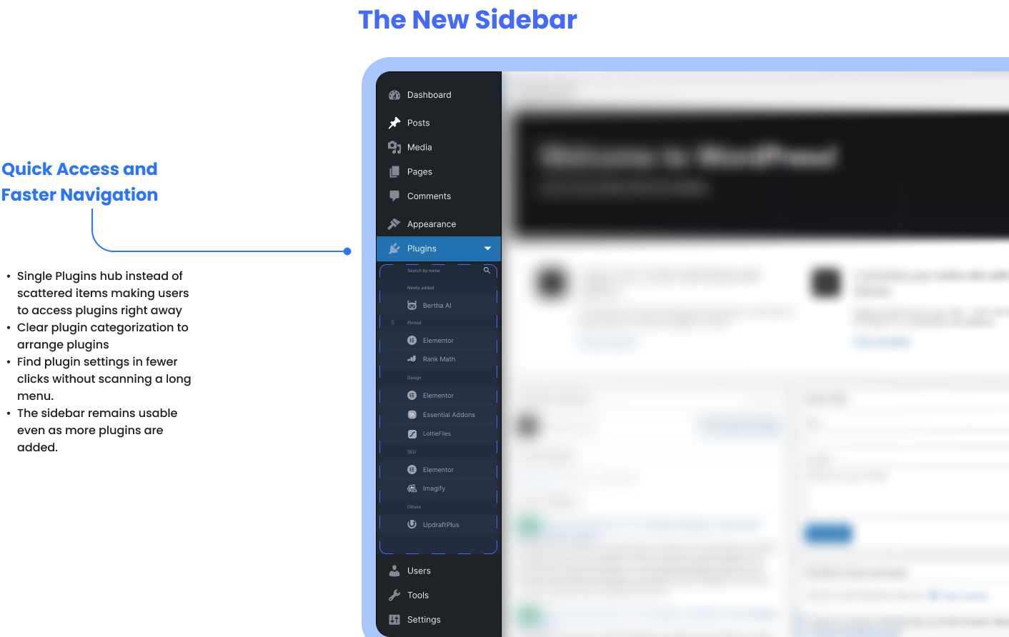
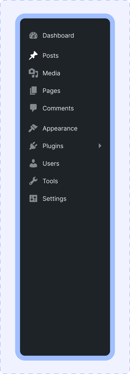
The New Sidebar
Collapsed
Expanded
Before
After
Impact & Result
This redesign demonstrates how improving information architecture can make the WordPress admin sidebar easier to scan, faster to navigate, and more predictable for plugin-heavy sites. While this is a conceptual solution, it highlights clear ways to declutter, reduce friction, support power-user workflows, and scale better as plugins accumulate, setting a strong foundation for further testing and iteration.
Overview
WordPress allows plugins to add their own top-level menu items in the admin sidebar, which often results in long, inconsistent, and hard-to-scan navigation—especially on sites with many plugins installed. Over time, this clutter increases cognitive load, slows down common tasks, and causes users to hunt for settings or click the wrong items.
This matters because power users and designers spend hours inside wp-admin daily; even small inefficiencies compound into real productivity loss and frustration.
Constraints: Desktop only. Scope limited strictly to the left sidebar/navigation. The visual style and interaction patterns of WordPress were preserved to avoid breaking familiarity. This is a conceptual UX redesign with no plugin-level code changes.
My role: UX Designer - research, information architecture, interaction design, and usability validation.
Problem Statement
In WordPress admin, plugins can freely add top-level sidebar menu items, leading to a long and inconsistent navigation structure. As more plugins are installed, the sidebar becomes harder to scan and predict. Users struggle to remember where plugin settings live and often misclick or waste time searching. The lack of structure reduces navigation clarity and overall efficiency for plugin-heavy sites.
Goals & Metrics
Goals
- Improve scannability and predictability of the wp-admin sidebar
- Reduce time spent searching for plugin settings
- Help users focus on frequently used tools first
Success Metrics
- Reduced time-to-find common plugin settings
- Fewer misclicks or back-tracking events
- Higher perceived ease-of-use (post-task rating)
Scope & Constraint
- Desktop wp-admin sidebar only
- Navigation and information architecture focus
- Native WordPress UI style preserved
- Conceptual redesign (no or minimal plugin code changes)
- Auto-categorization where possible
Out of Scope
- Mobile admin experience
- Full dashboard redesign
- Gutenberg or content editor changes
- Plugin developer UI redesigns
Desk Research
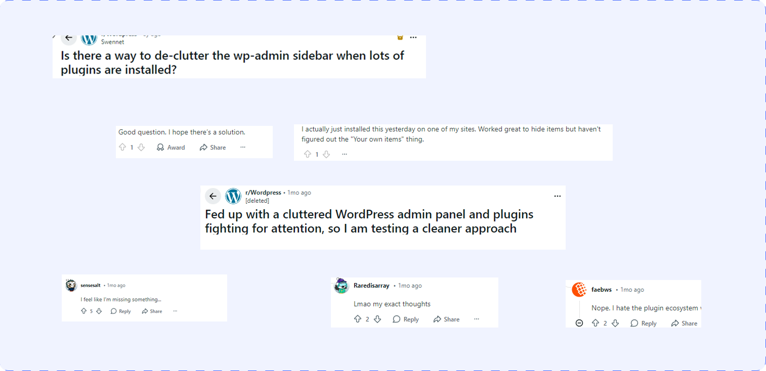
Many WordPress and Reddit discussions highlight admin clutter as a pain point on plugin-heavy sites, especially for freelancers managing multiple projects. Plugins add random top-level menu items, resulting in inconsistent naming and placement across installs.
Power users rely heavily on muscle memory; shifting or bloated menus slow task completion.
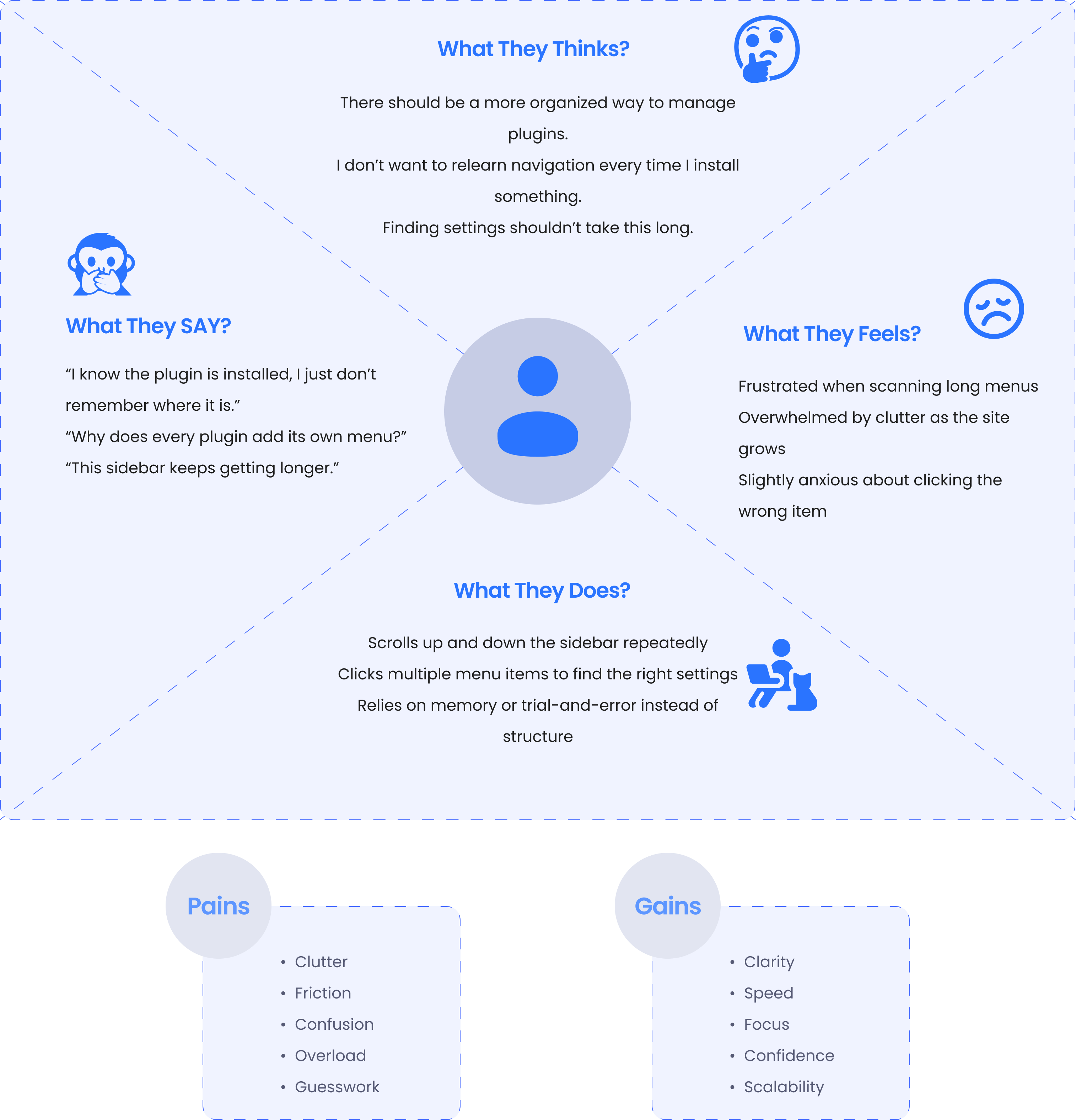
Interview Outcome
After completing desk research and noticing recurrent complaints about wp-admin sidebar clutter across Reddit and WordPress community discussions, I conducted five interviews with WordPress users collected from these spaces. While interviews were not initially planned, the consistency of feedback prompted me to validate assumptions directly with end users. The interviews reinforced the need for a more structured and predictable sidebar experience for plugin-heavy sites.
Key Insights
- Users struggle to scan and remember plugin locations in long sidebars
- Inconsistent plugin naming and placement breaks navigation confidence
- Faster access to frequently used plugins is more valuable than more menu items
Evidence
- All 5 participants mentioned frequently used plugins deserve faster access
- 4/5 participants mentioned spending extra time "searching" for plugin settings
- 3/5 participants reported misclicking or opening the wrong menu item at least once per session
- Direct feedback includes: "I know the plugin is there, I just don't remember where it is placed."
- WordPress discussions and Reddit threads were filled with recurring complaints about WordPress admin clutter and plugin menus growing out of control
Jobs to be done
When managing a plugin-heavy WordPress site, I want to find plugin settings quickly so I can complete tasks without hunting through the sidebar.
When I frequently use certain plugins, I want faster access to them so I can avoid repeated scanning and misclicks.
User Needs
-
Clear and predictable navigation in the wp-admin sidebar
-
Faster access to frequently used plugin settings
-
Reduced cognitive load when scanning the menu
-
A structure that scales as more plugins are installed
-
Familiar WordPress experience without relearning
Solution
Based on desk research, Reddit discussions, and five user interviews, the solution focuses on improving navigation clarity rather than changing WordPress's visual design. All plugin-related menu items are consolidated into a single Plugins hub, reducing sidebar clutter and improving scannability. Plugins are grouped into logical categories, while frequently used tools can be pinned for quick access. This structure creates a more predictable, scalable sidebar that supports power-user workflows without breaking familiar WordPress admin patterns.
Personas
User Persona-1

Ali Khan
Freelance WordPress Designer
About
Maslow Pyramid
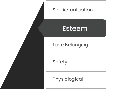
Description
Ali builds and maintains WordPress sites for clients. He installs SEO, performance, security, and page builder plugins on almost every project and spends hours inside wp-admin daily. Speed and predictability matter more to him than customization.
Pain points
- Too many plugin menu items clutter the sidebar
- Inconsistent placement breaks muscle memory
- Wastes time searching for plugin settings
I know what I need to open — I just don't remember where the plugin put it.
User Persona-2
Description
Sara updates content, manages plugins, and adjusts site settings when needed. She isn't deeply technical and often feels overwhelmed by the admin sidebar as the site grows and more plugins are added.
Pain points
- Long menus feel overwhelming
- Unsure where to click for plugin settings
- Afraid of opening the wrong option
The sidebar feels messy — I just click until I find the right thing.

Sara Ahmed
Website Admin
About
Maslow Pyramid
Screens in Action

“Small tweaks, big impact—my experience just became smoother and better!”
Reflection
This case study reaffirmed how small information architecture changes can have a large impact on daily workflows, especially for power users. Instead of redesigning the entire interface, focusing on structure, predictability, and scale proved more effective. Working with real constraints, such as preserving WordPress's existing UI, helped shape a solution that feels realistic and implementable. If taken further, this concept would benefit from testing with a broader set of WordPress admins and validating plugin categories with real usage data.
Results & Learnings
The redesigned sidebar concept demonstrates a clearer and more scalable navigation model for plugin-heavy WordPress sites. By consolidating plugins into a single hub and introducing pinning, the solution reduces visual clutter and supports faster access to frequent tools. This project highlights the importance of prioritizing recognition over recall and designing systems that grow gracefully as complexity increases.
This project proved that improving information architecture, without changing visual design, can significantly improve usability. It strengthened my ability to work within existing systems, validate assumptions through research, and design solutions that scale with real-world complexity.