Start by organising the questions.
Lillup brings multiple journeys into one product. Before deciding how individual screens should look, the work needs a clear view of users, entry points and the actions connecting those screens.
The design question: how can the team turn a broad product scope into understandable journeys and focused interface decisions?
The 48-Participant Interviews Discovery
- Inbound operations documented multiple drop-offs connected to main menu interactions. The testing focused us to merge nested list components into a progressive platform navigation format utilizing bottom sheet components.
- Teachers, administrators, and students act differently across the platform. Primary user paths needed to merge into a single scalable infrastructure to avoid fragmentation and ensure consistent component states.
- Restructuring the primary architecture. Elements representing key navigation utilities on the application required specific visual adjustments to guide the user naturally to the core application.
Make the structure visible.
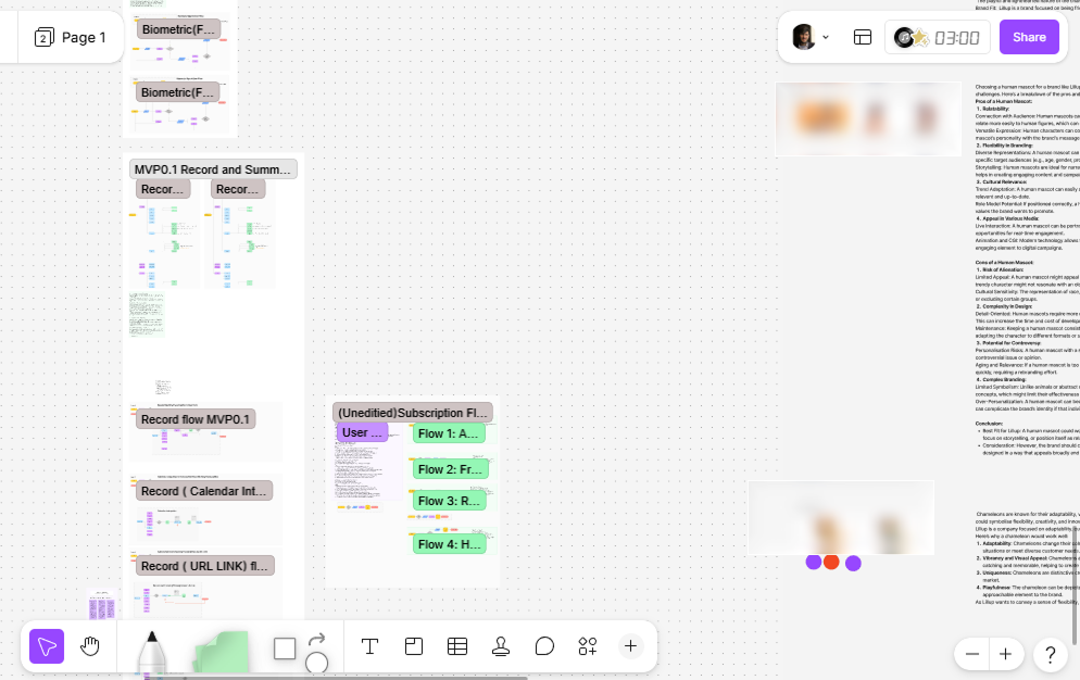
The process boards bring together sorting exercises, journey maps, proto-personas and problem statements. These artefacts organise the discovery work and provide a shared reference for the flows.
Proto-personas are starting assumptions. They need evidence from actual users before they can be treated as validated descriptions of an audience.
Connect the journey to the interface.
Map connected actions before styling them.
The flow boards show linked steps for onboarding and product interactions. This makes the relationship between entry points, choices and subsequent screens explicit.
The trade-off: A large flow can become difficult to read. Individual tasks need focused walkthroughs alongside the overall map.
Explore the journey through concrete screens.
The mobile explorations connect onboarding and interaction patterns with colour and component choices. Moving into screens makes the proposed journey easier to discuss.
The trade-off: A coherent visual direction does not establish usability. The next step is observing people attempt the tasks.
A foundation for product conversations.
- Organised discovery artefacts and journey maps.
- Connected user-flow explorations.
- Mobile interface explorations for onboarding and interaction.
The value of a process artefact is the decision it helps the team make.
What I’d test next
I would choose a specific onboarding journey, recruit people who match the intended users and observe where they hesitate, backtrack or need help. The next version should connect each meaningful design change to the observation behind it.
Request full Figma Walkthrough ↗